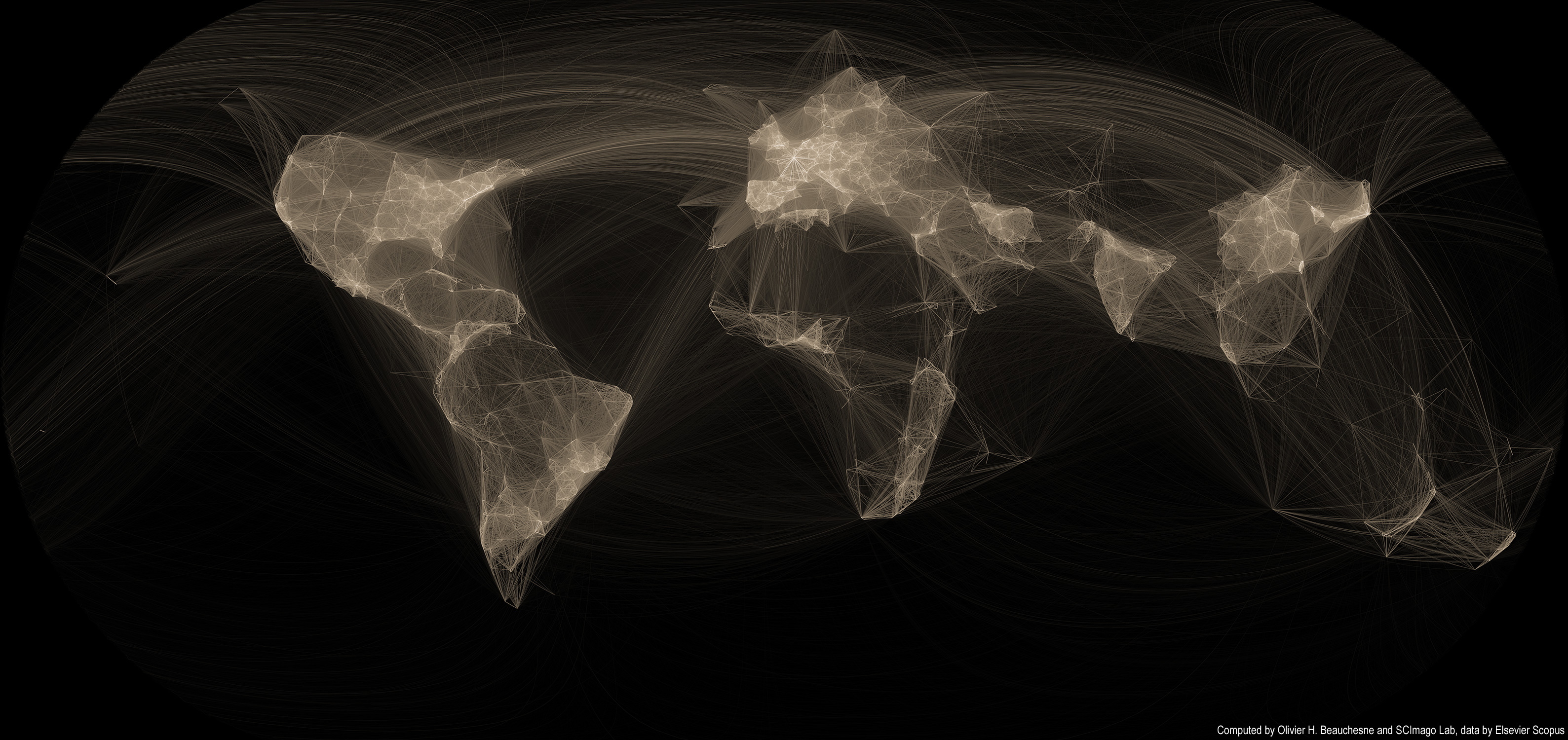
 Several years ago, I created a map of scientific collaborations. The attention this map obtained surpassed my wildest expectations; it got published in the scientific and popular press all around the world! I had mainly forgotten about it until I received an email that rekindled my interest in this visualization and I thought it was high time to revisit this visualization.
Unfortunately, scientific papers (and associated data) are closely guarded and only a handful of firms have full access to them. I now work in a very different field, so I lost access to this dataset. But while perusing my Twitter feed, I came across the very active feed of Scimago Lab. Their social media presence and their incredible interactive visualizations convinced me that they might be interested in collaborating. I sent off an email to their founder, Félix de Moya and, lo and behold, he was interested in collaborating. Cool!
Read on for more maps and an overview of the methodology >>
Continue reading “Map of scientific collaboration (Redux!)”
Tag: map
Distribution du financement politique à Montréal
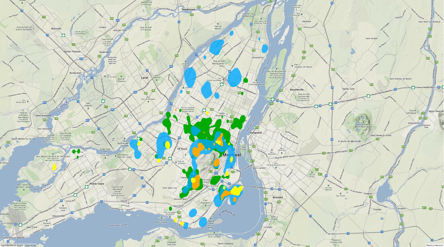
Comme lors des années précédentes, La Presse a conçu une carte du financement politique à Montréal. Les responsables de ces cartes (Cédric Sam, Pierre-André Normandin et Thomas de Lorimier) ont dû composer avec l’absence de données gouvernementales standardisées et contacter chaque parti politique pour obtenir ces données.
Le résultat est très intéressant et ils font preuve d’une très grande générosité en partageant les données recueillies. Les données ouvertes comprennent la latitude et la longitude de chaque don ce qui facilite leur utilisation dans les logiciels GIS comme ArcGIS et Quantum GIS. Je me suis donc amusé ce dimanche à analyser et créer des cartes illustrant la distribution des dons. La carte à gauche illustre les concentrations de financement pour chaque parti. Par exemple, il y a une concentration de financement pour Projet Montréal sur le Plateau, Villeray et Hochelaga.
Cliquez sur le lien à droite pour lire (et voir!) la suite >>
Continue reading “Distribution du financement politique à Montréal”
A Map of the Geographical Structure of Wikipedia Links
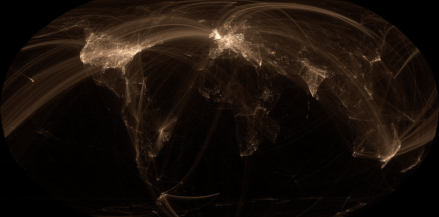
There are a lot of Wikipedia visualizations. Some concentrate on article contents, others on the links between articles and some use the geocoded content (like in my previous blog post).
This new visualization is novel because it uses the geographical content of Wikipedia in conjunction with the links between articles. In other words, if a geocoded article (that is, an article associated with a location like a city) links to another geocoded article, a line will be drawn between these two points. The result can be found on the map on the left.
Read on for zoomed views, slideshows, browsable maps, etc.
Continue reading “A Map of the Geographical Structure of Wikipedia Links”
A Map of the Geographic Structure of Wikipedia Topics
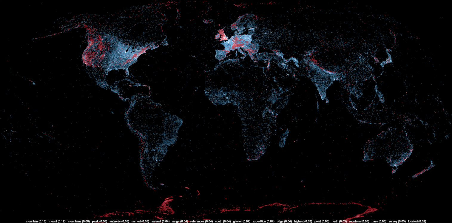
A large number of Wikipedia articles are geocoded. This means that when an article pertains to a location, its latitude and longitude are linked to the article. As you can imagine, this can be useful to generate insightful and eye-catching infographics. A while ago, a team at Oxford built this magnificent tool to illustrate the language boundaries in Wikipedia articles. This led me to wonder if it would be possible to extract the different topics in Wikipedia.
This is exactly what I managed to do in the past few days. I downloaded all of Wikipedia, extracted 300 different topics using a powerful clustering algorithm, projected all the geocoded articles on a map and highlighted the different clusters (or topics) in red. The results were much more interesting than I thought. For example, the map on the left shows all the articles related to mountains, peaks, summits, etc. in red on a blue base map. The highlighted articles from this topic match the main mountain ranges exactly.
Read on for more details, pretty pictures and slideshows.
Continue reading “A Map of the Geographic Structure of Wikipedia Topics”
Géolocalisation de #qc2012
 On a beaucoup parlé des utilisateurs des médias sociaux durant la dernière campagne électorale (#qc2012 pour les intimes). Qui sont-ils? D’où viennent-ils? De quoi parlent-ils?
Les analyses de contenu peuvent répondre à certaines de ces questions, mais pour répondre à la question « où sont-ils? », il faut soit procéder par sondage ou utiliser les données que Twitter nous offre si gentiment. Si les utilisateurs de Twitter activent la fonction de localisation, il est possible de savoir où le “twitteur” est situé. Il suffit ensuite d’importer les données dans un logiciel de visualisation géographique ou Google Tables pour obtenir une carte interactive.
Continue reading “Géolocalisation de #qc2012”
Mapping Political Financing in Montréal
 Using the data cleaned and released by Cedric Sam and Thomas de Lorimier (available on Cyberpresse), I geocoded the data and applied a density map function. The map shows interesting financial patterns in Montréal for the Bloc Québecois and for the Liberal Party of Canada. I’ve chosen those two parties since they have a strong historical influence in Montréal. As we can see on the map, the western part of Montréal is clearly Liberal while the east is more aligned with the Bloc Québécois.
The most interesting clusters are on both sides of Mount Royal. One side, situated in Westmount, contributes noticeably to the PLC while the other side, in Outremont, donates more to the Bloc Québec. To anybody living in Montréal, it’s hardly a surprising fact, but I think it’s nice to see it on a map.
Map of scientific collaboration between researchers
 I was very impressed by the friendship map made by Facebook intern, Paul Butler and I realized that I had access to a similar dataset at Science-Metrix (an old employer I left a while ago). Instead of a database of friendship data, I had access to a database of scientific collaborations. Bibliometric firms use this kind of data to get a (very) approximated view of science, but I thought that for a data visualization, it was good enough
This post is now obsolete, please see the new one (click here!)
Continue reading “Map of scientific collaboration between researchers”