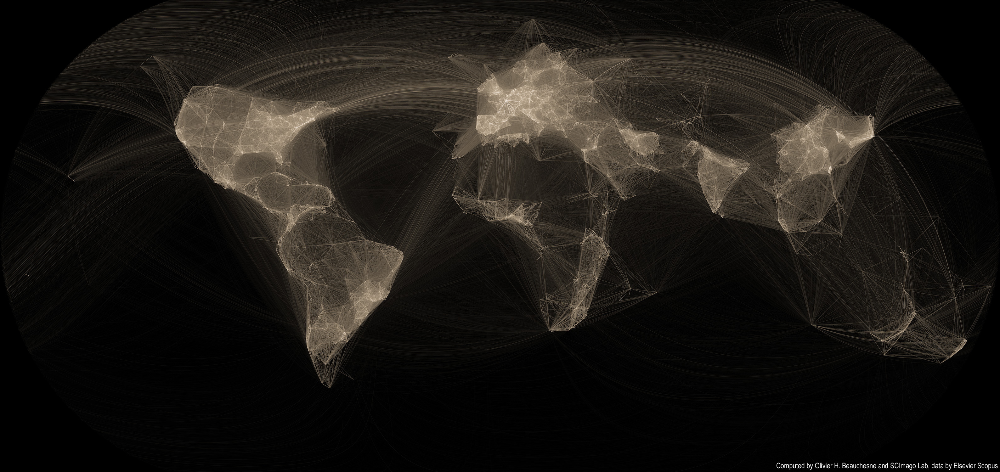
 Several years ago, I created a map of scientific collaborations. The attention this map obtained surpassed my wildest expectations; it got published in the scientific and popular press all around the world! I had mainly forgotten about it until I received an email that rekindled my interest in this visualization and I thought it was high time to revisit this visualization.
Unfortunately, scientific papers (and associated data) are closely guarded and only a handful of firms have full access to them. I now work in a very different field, so I lost access to this dataset. But while perusing my Twitter feed, I came across the very active feed of Scimago Lab. Their social media presence and their incredible interactive visualizations convinced me that they might be interested in collaborating. I sent off an email to their founder, Félix de Moya and, lo and behold, he was interested in collaborating. Cool!
Read on for more maps and an overview of the methodology >>
Continue reading “Map of scientific collaboration (Redux!)”