 T-SNE, PCA and other dimensionality reduction algorithms have always been a good way to visualize high-dimensionality datasets. Unfortunately, most of the time, the visualization stops there. If another view of the data is needed, a new chart needs to be computed, projected and displayed.
Toolkits like Bokeh have been a great help to build interactive charts, but the analysis dimension has always been a bit neglected. Last week-end, I took a few hours to glue some Bokeh components together and built an interactive visualization explorer: Chart Miner.
The tool is available on github where you’re free to either download, clone or even fork it. Get the code here.
Chart Miner takes a JSON file as an input; this file describe the dataset to be displayed. The format is pretty simple: every data point is identified by a unique identifier (id), name (title), coordinates (x and y) and a bunch of attributes – each having a name and a list of values. The attributes are the variables that can be filtered out, used as dimensions, etc.
An input data file would look like this (see the test.json file in the repo):
[sourcecode language=”javascript” title=”data.json”]
{
"x":12,
"y":32,
"id": 1,
"title":"name of point 1",
"attributes":[
{
"name":"collection",
"values":[1]
},
{
"name": "tags",
"values" : ["tag 1", "tag 2", "tag 3", "tag 4"]
}]
},
[/sourcecode]
Chart Miner has many dependencies; most of them are linked to the bokeh toolkit. A “pip install bokeh” should install Bokeh and the related dependencies. Once those dependencies resolved, the next step is to launch the bokeh server instance (using “bokeh serve”) in the code repository. Then, you can launch Chart Miner directly by executing it directly from the command line:
python chart_miner.py
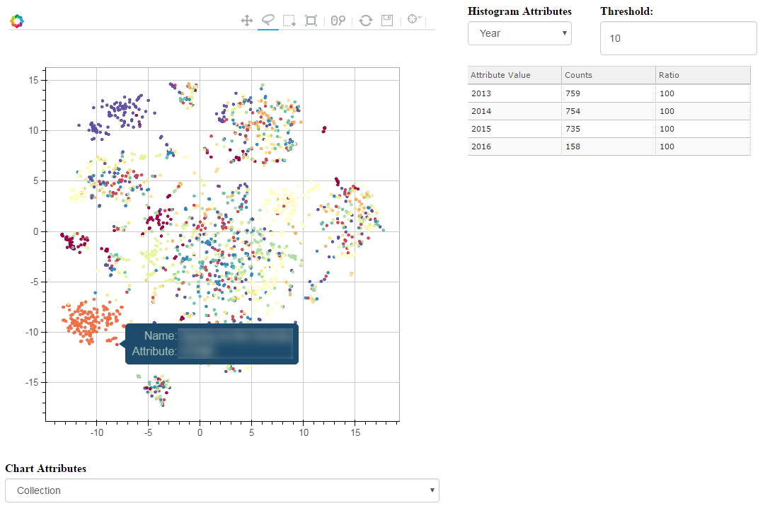
This will launch a web browser window and open a page with two visible panes as shown in the above screenshot.
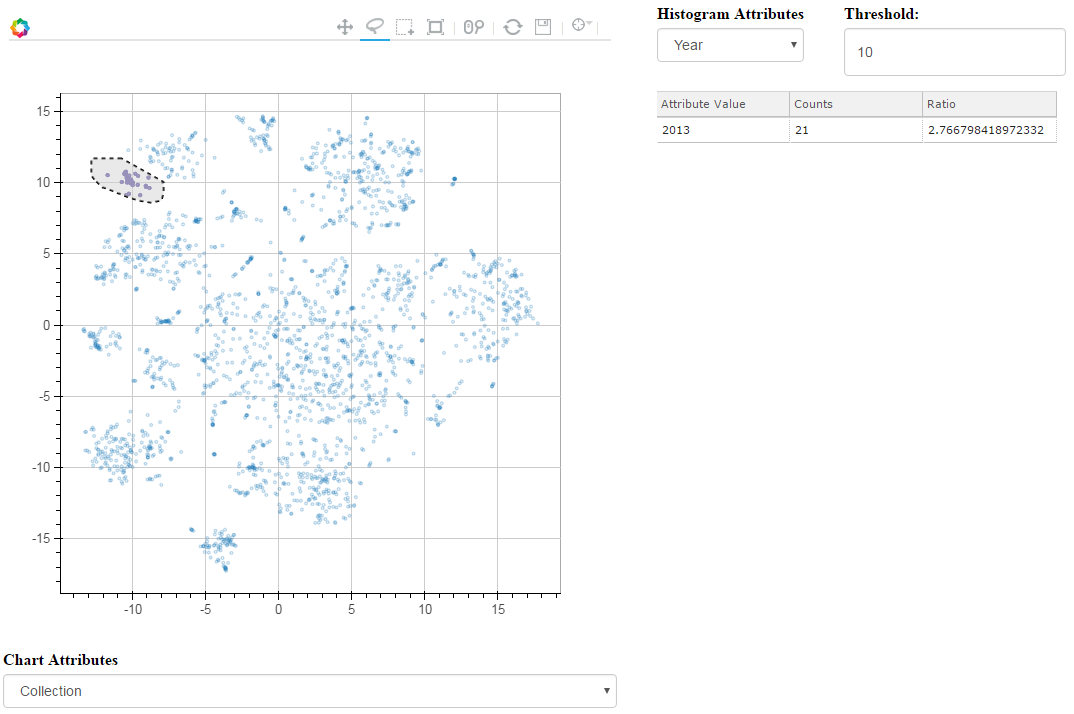 The left pane shows the data points shaded by the dimensions (or attributes) available in the drop down menu underneath the chart. By using the selection tools available in the chart menu, the attributes of the selected data points will be displayed in the table located on the right pane.
This right panes contains two sections: the first section is an attributes selection drop down menu that will show only a given dimension of the points. The threshold field is used to filter out unimportant data that can clutter the table. The second section is the table that counts the number of dimension (as selected in the drop down menu) values.
At my day job, we’ve been using this tool as a visual aid to understand our video recommendation data. Chart Miner give us a bird eye view of our catalog and help us optimize the recommendations. While exploration was possible before using this system, it was more cumbersome and would introduce a lag as every time a chart was shown more questions were raised and new charts would have to be computed before communicating them to the leadership.
Now, we use this tool and it’s a great conversation starter and enables us to raise – and answer – questions as they arise.