As we saw in the previous article, temporal analysis of individual keywords can be very interesting and uncover interesting trends, but it can be difficult to get an overview of a whole corpus. There’s just too much data.
One solution would be to group similar subjects together. This way, we could scale down a corpus of 500,000 keywords to a handful of topics. Of course, we’ll be losing some definition, but we’ll be gaining a 10,000 feet view of the corpus. In all cases, we can always refer to the individual keywords if we want to take a closer look.
To identify topics from the corpus, I used the tried and true Latent Dirichlet Allocation (LDA) algorithm. Simply put, this model is based on the assumption that every fragment (or document) consists of a mixture of several topics and that every word is attributable to one of the topic in a given fragment. LDA is a very powerful topic modelling algorithm, so there’s tons of very good explanations of how it works, so I won’t reformulate them, but I like this one a lot.
I’ve been using this algorithm for several years now and it’s one of the most reliable, faster and intuitive model to cluster documents into topics. Because this algorithm is a bag-of-word model, it doesn’t care about the order of the words in the document. For our project, it doesn’t matter since we don’t want to extract precise information about a given fragment and its grammar, but rather identify its topic.
Several implementations of the LDA algorithm exist, but not all of them can process a huge amount of data easily and painlessly. I tried the Apache Spark implementation, but it proved to be too immature for a large dataset. It ran out of disk space after 5-6 hours without showing any kind of progress. Gensim seemed to work well, but it was a bit slow since it’s coded in Python. The Yahoo one is faster but is not maintained anymore and a pain to compile.
The best one available – in my opinion – is the one coded by Microsoft researchers: LightLDA. It’s amazingly fast, supports multiple machines and the code is available on github. It only took one EC2 machine (30 GB RAM with 16 vCPU) machine a couple of hours to cluster our dataset. Using a spot instance, the total cost for the clustering experiment – including tuning it, setting it up, the practice runs, etc. was around 4.25$. This was more than reasonable for a project like this one.
I chose to cluster the corpus in 100 topics and used 500 iterations. From experience, the likelihood has time to settle after that many iterations. I chose 100 topics because it made for a manageable amount and it gives us around 6 or 7 topics per year (100 topics / 15 years). Of course, the proper way would be to calculate different amount of topics and measure the quality of the clustering and keep the best amount of topics. Since I’m having fun here, I’m sticking with 100 topics.
Once the LDA clustering had finished (after 500 iterations, which is usually more than enough for the likelihood to settle), I was left with a couple of data files that describe the model, the documents and the topics. These files were then processed using the load_topics.py script and sent to a SQLite database for easy processing and querying. I now had a database containing the documents, the metadata and topic associated to the documents. We can now to explore the different topics.
Some topics are useless and are mostly common words, adjectives, or not linked to events:
[sourcecode language=”text”]
Topic 4: know, think, going, yes, people, right, want, mean, well, dr
Topic 11: car, know, back, see, didn, went, saw, right, door, going
Topic 15: think, know, people, well, going, mean, want, question, right, way
Topic 43: morning, cnn, 00, hour, live, right, new, carol, now, eastern
[/sourcecode]
Other identifies some long standing interests of the population:
[sourcecode language=”text”]
Topic 8: music, know, song, love, rock, time, new, band, great, people
Topic 10: snow, going, weather, right, see, now, here, today, morning, rain
Topic 12: game, team, world, baseball, now, players, league, sports, nba, fans
Topic 24: prices, europe, now, gas, oil, european, world, percent, going, price
Topic 26: god, people, church, faith, muslim, religious, religion, christian, muslims, jesus
Topic 27: president, justice, general, attorney, house, court, now, white, senator, committee
Topic 34: jobs, tax, economy, people, going, percent, cuts, taxes, job, now
[/sourcecode]
While some are very topical and are sometime only a blip in the media cycle:
[sourcecode language=”text”]
Topic 6: trump, donald, think, debate, going, know, clinton, right, republican, now
Topic 7: bush, president, kerry, john, campaign, george, gore, senator, al, think
Topic 13: know, evidence, case, casey, defense, anthony, going, nancy, well, peterson
Topic 35: syria, now, libya, syrian, government, gadhafi, turkey, people, regime, opposition
Topic 67: isis, now, syria, right, know, group, paris, here, attack, french
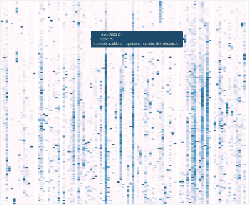
Topic 75: iraq, saddam, weapons, war, hussein, united, now, council, mass, destruction
[/sourcecode]
Since documents can be associated to topics, it makes it really easy to use the timeline visualization tool built in the last article to explore individual topics across time. The tool, configured to show topics, can be accessed here. The following screenshots are from the same tool:
[huge_it_gallery id=”8″]
While the tool as described above can be used to visualize a given topic, it’s more difficult to appreciate the whole corpus in one global view. To have a true 10,000 feet view of the corpus, I felt like a heatmap would be a good idea. One axis could be the timeline while the other would be the topic index.
To build this heatmap, I used the Bokeh toolkit which makes building interactive visualization really easy. In this visualization, every cell is shaded following the percentage of fragments (documents) that are from a given topic (where at least 50% of the content of a given fragment is from a given topic) for that given topic and time period. The time range – in this case, the whole 15 years – is broken down per month (180 months) as seen on the left of the chart while all the topics are on the top. By looking at a given topic, it becomes easy to see where the topic was more salient in its lifetime. An interactive version of this chart can be accessed here.
Interestingly, some topics (rotated for space considerations) are just blips:

While other are more long term:
![]()
And some are very salient and then drop off:
![]()
In the next article, we’ll look at other ways to observe topics in our news corpus.