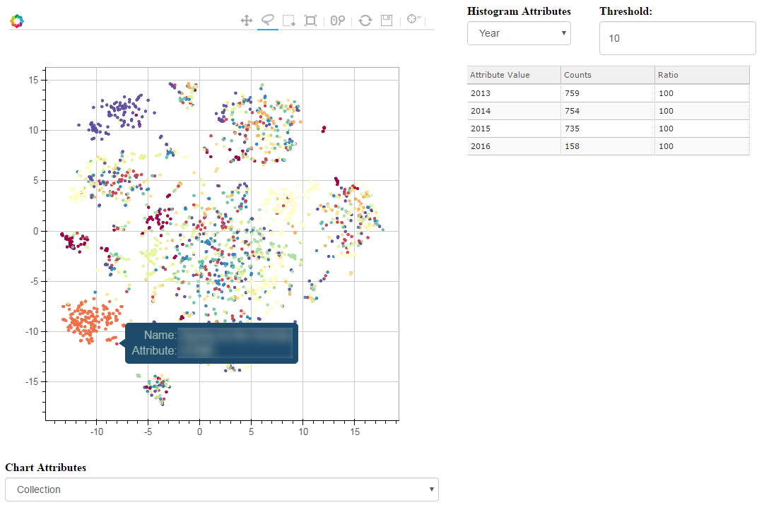
 T-SNE, PCA and other dimensionality reduction algorithms have always been a good way to visualize high-dimensionality datasets. Unfortunately, most of the time, the visualization stops there. If another view of the data is needed, a new chart needs to be computed, projected and displayed.
Toolkits like Bokeh have been a great help to build interactive charts, but the analysis dimension has always been a bit neglected. Last week-end, I took a few hours to glue some Bokeh components together and built an interactive visualization explorer: Chart Miner.
Continue reading “Chart Miner – Exploring 2d Projections”
Category: Coding
15 Years of News – Analyzing CNN Transcripts: Visualizing Topics
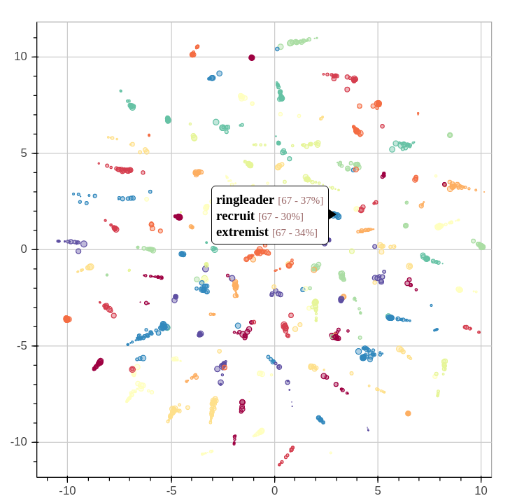
By extracting several topics from our news corpus, we gained a 10,000 feet view of corpus. We were able to outline many trends and events, but it took a bit of digging. This article will illustrate how the topics relate each to one another. We’ll even throw a bit of animation to take a look back the last 15 years.
When we extracted the topics from the corpus, we also found another way to describe all the news snippets and words. Instead of seeing a document as a collection of words, we could see it as a mixture of topics. We could also do the same thing with topics: every topics is a mixture of words used in its associated fragments.
Continue reading “15 Years of News – Analyzing CNN Transcripts: Visualizing Topics”
15 Years of News – Analyzing CNN Transcripts: Topics
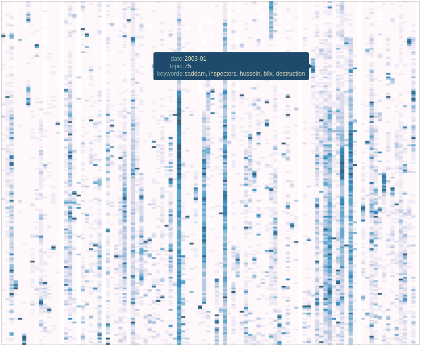
As we saw in the previous article, temporal analysis of individual keywords can be very interesting and uncover interesting trends, but it can be difficult to get an overview of a whole corpus. There’s just too much data.
One solution would be to group similar subjects together. This way, we could scale down a corpus of 500,000 keywords to a handful of topics. Of course, we’ll be losing some definition, but we’ll be gaining a 10,000 feet view of the corpus. In all cases, we can always refer to the individual keywords if we want to take a closer look. Continue reading “15 Years of News – Analyzing CNN Transcripts: Topics”
15 Years of News – Analyzing CNN Transcripts: Timelines
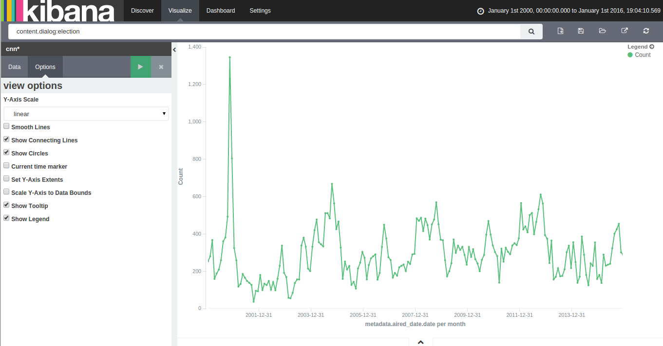
With 15 years of CNN transcripts loaded a database, I could now run queries to visualize the occurrences of words – like names – across time. Since I used a textual database name ElasticSearch, I could use Kibana to chart the keywords. Kibana is a good tool to build dashboards, but it’s not really suited to analyze extensively time series because it lacks an easy way to add several search terms on the same chart. Also, it doesn’t easily show percentages of occurrences in a corpus for a giving time period instead of absolute occurrences. This makes Kibana a good tool for a quick look at the data or to debug an issue with our transcript scrapper.
With this in mind, I used Amazon’s DynamoDB database, the HighChart Javascript library and a bit of glue logic to build my own tool to visualize the last 15 years of News!
Continue reading “15 Years of News – Analyzing CNN Transcripts: Timelines”
15 Years of News – Analyzing CNN Transcripts: Retrieving & Parsing
A while back, I saw that the Internet Archive hosted an archive of CNN transcripts from 2000 to 2012. The first thing that came to my mind was that this was an amazing corpus to study. It contained the last 12 years of news in textual form at the same place. I felt that it would be an amazing project to retrieve all the transcript from 2000 to today and someone went already to the trouble of downloading this corpus.
Unfortunately, the data was basically a dump of the transcripts pages from CNN. This isn’t a problem for archival purposes, but for analysis, it would make things a bit difficult. For my new project, it meant that I would need to find a way to download all the transcripts from CNN, parse them and dump them to a database. To make things even more difficult, the HTML from the early 2000s was more about form that function. In other words, the CNN webmasters (in the 2000, web designers or developers didn’t exist, they were webmasters!) would throw something that would render in Internet Explorer or Netscape Navigator and call it a day. There was no effort in making the layout and content organized.
Continue reading “15 Years of News – Analyzing CNN Transcripts: Retrieving & Parsing”
Asterisk Call Notifications to PushBullet

Several years ago, I wrote a python script to notify me when my asterisk server got an incoming call. I programmed this out of pure laziness: I wanted to know who was calling me without having to look at my phone.
This script would show a pop-up on my laptop whenever I got a call and the notification would show who was calling and for whom. This was very useful since I was traveling a lot during that time, so I would know if somebody was trying to reach me at home.
I’m still using this script, but I’m finding myself using my cellphone more often than my laptop when I’m out of the house. So, I modified my script to send a notification to my smart phone instead of my laptop.
Continue reading “Asterisk Call Notifications to PushBullet”
A Map of the Geographical Structure of Wikipedia Links
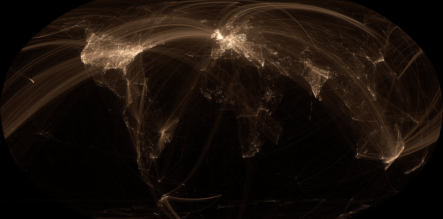
There are a lot of Wikipedia visualizations. Some concentrate on article contents, others on the links between articles and some use the geocoded content (like in my previous blog post).
This new visualization is novel because it uses the geographical content of Wikipedia in conjunction with the links between articles. In other words, if a geocoded article (that is, an article associated with a location like a city) links to another geocoded article, a line will be drawn between these two points. The result can be found on the map on the left.
Read on for zoomed views, slideshows, browsable maps, etc.
Continue reading “A Map of the Geographical Structure of Wikipedia Links”
A Map of the Geographic Structure of Wikipedia Topics
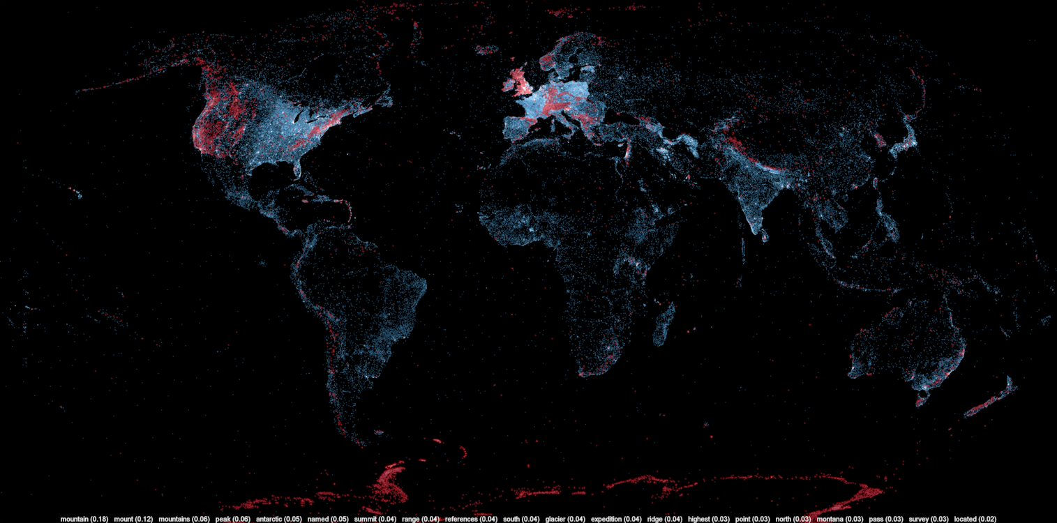
A large number of Wikipedia articles are geocoded. This means that when an article pertains to a location, its latitude and longitude are linked to the article. As you can imagine, this can be useful to generate insightful and eye-catching infographics. A while ago, a team at Oxford built this magnificent tool to illustrate the language boundaries in Wikipedia articles. This led me to wonder if it would be possible to extract the different topics in Wikipedia.
This is exactly what I managed to do in the past few days. I downloaded all of Wikipedia, extracted 300 different topics using a powerful clustering algorithm, projected all the geocoded articles on a map and highlighted the different clusters (or topics) in red. The results were much more interesting than I thought. For example, the map on the left shows all the articles related to mountains, peaks, summits, etc. in red on a blue base map. The highlighted articles from this topic match the main mountain ranges exactly.
Read on for more details, pretty pictures and slideshows.
Continue reading “A Map of the Geographic Structure of Wikipedia Topics”
Traquer les avions en temps réel avec une antenne et 20$
 Un super-bidouilleur a récemment découvert qu’en utilisant une certaine marque (RTL) de clés USB pour écouter la télé, il était possible de capter et décoder une très grande partie du spectre radio à l’aide d’un petit logiciel (RTL-SDR). Plusieurs appareils, comme le USRP, permettaient déjà de le faire depuis quelques années, mais ces appareils étaient plutôt dispendieux et exigeaient des connaissances plutôt poussées en électronique et en informatique.
Cette fusion entre l’informatique et la radio est connue comme la “Software Defined Radio”, ou la radio définie par logiciel. En d’autres mots, des codes informatiques font le travail qui était auparavant effectué par des circuits spécialisés. Il devient donc possible de décoder des contenus seulement accessibles à certains spécialistes ou à l’aide équipement très dispendieux. Ces contenus incluent les informations émises par les avions, comme le ADS-B. Autrement dit, il devient possible de recevoir la localisation des avions de lignes en temps réel .
Continue reading “Traquer les avions en temps réel avec une antenne et 20$”
Limesurvey: How to import responses from a modified deactivated table
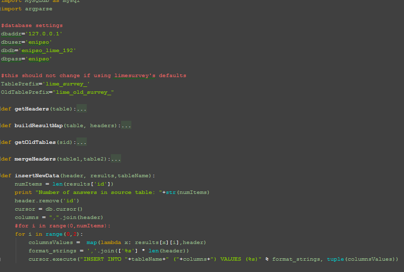 A good number of my consulting clients use the very useful and powerful survey tool Limesurvey. Unfortunately, since version 1.92+, it seems impossible to reimport deactivated responses tables into new response tables if the survey was modified. I’m sure this doesn’t matter for long form surveys and mainly static surveys, but some of my clients use this platform as a dynamic form engine. In that case, forms can and will change over the duration of a project.
To resolve this problem and enable the importation of old responses tables, I’ve written a quick Python script. It uses MySQLdb, but that library should be installed by default on most Linux boxes. The script also requires a MySQL database backend but it should be easily adaptable to other database engines.
Continue reading “Limesurvey: How to import responses from a modified deactivated table”