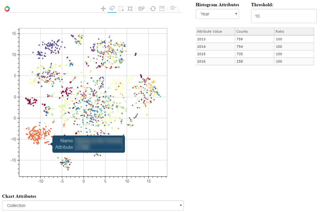
 T-SNE, PCA and other dimensionality reduction algorithms have always been a good way to visualize high-dimensionality datasets. Unfortunately, most of the time, the visualization stops there. If another view of the data is needed, a new chart needs to be computed, projected and displayed.
Toolkits like Bokeh have been a great help to build interactive charts, but the analysis dimension has always been a bit neglected. Last week-end, I took a few hours to glue some Bokeh components together and built an interactive visualization explorer: Chart Miner.
Continue reading “Chart Miner – Exploring 2d Projections”
Category: Python
15 Years of News – Analyzing CNN Transcripts: Visualizing Topics
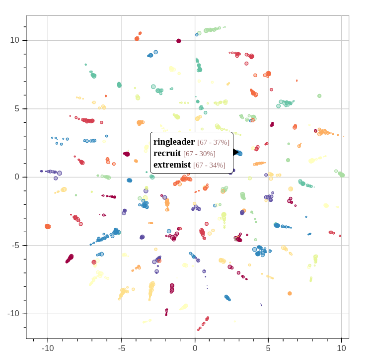
By extracting several topics from our news corpus, we gained a 10,000 feet view of corpus. We were able to outline many trends and events, but it took a bit of digging. This article will illustrate how the topics relate each to one another. We’ll even throw a bit of animation to take a look back the last 15 years.
When we extracted the topics from the corpus, we also found another way to describe all the news snippets and words. Instead of seeing a document as a collection of words, we could see it as a mixture of topics. We could also do the same thing with topics: every topics is a mixture of words used in its associated fragments.
Continue reading “15 Years of News – Analyzing CNN Transcripts: Visualizing Topics”
15 Years of News – Analyzing CNN Transcripts: Topics

As we saw in the previous article, temporal analysis of individual keywords can be very interesting and uncover interesting trends, but it can be difficult to get an overview of a whole corpus. There’s just too much data.
One solution would be to group similar subjects together. This way, we could scale down a corpus of 500,000 keywords to a handful of topics. Of course, we’ll be losing some definition, but we’ll be gaining a 10,000 feet view of the corpus. In all cases, we can always refer to the individual keywords if we want to take a closer look. Continue reading “15 Years of News – Analyzing CNN Transcripts: Topics”
15 Years of News – Analyzing CNN Transcripts: Timelines
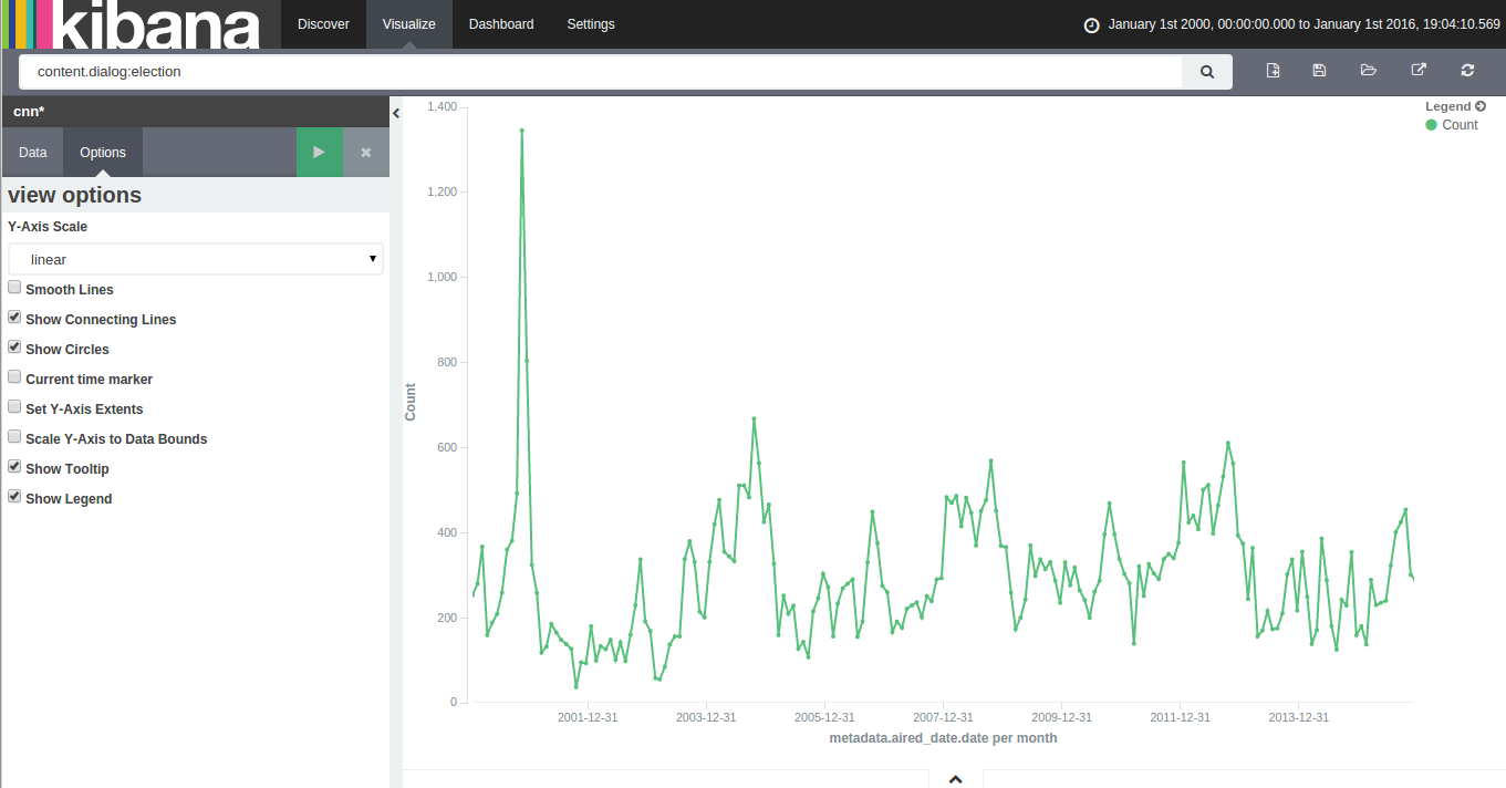
With 15 years of CNN transcripts loaded a database, I could now run queries to visualize the occurrences of words – like names – across time. Since I used a textual database name ElasticSearch, I could use Kibana to chart the keywords. Kibana is a good tool to build dashboards, but it’s not really suited to analyze extensively time series because it lacks an easy way to add several search terms on the same chart. Also, it doesn’t easily show percentages of occurrences in a corpus for a giving time period instead of absolute occurrences. This makes Kibana a good tool for a quick look at the data or to debug an issue with our transcript scrapper.
With this in mind, I used Amazon’s DynamoDB database, the HighChart Javascript library and a bit of glue logic to build my own tool to visualize the last 15 years of News!
Continue reading “15 Years of News – Analyzing CNN Transcripts: Timelines”
Asterisk Call Notifications to PushBullet

Several years ago, I wrote a python script to notify me when my asterisk server got an incoming call. I programmed this out of pure laziness: I wanted to know who was calling me without having to look at my phone.
This script would show a pop-up on my laptop whenever I got a call and the notification would show who was calling and for whom. This was very useful since I was traveling a lot during that time, so I would know if somebody was trying to reach me at home.
I’m still using this script, but I’m finding myself using my cellphone more often than my laptop when I’m out of the house. So, I modified my script to send a notification to my smart phone instead of my laptop.
Continue reading “Asterisk Call Notifications to PushBullet”
A Map of the Geographical Structure of Wikipedia Links

There are a lot of Wikipedia visualizations. Some concentrate on article contents, others on the links between articles and some use the geocoded content (like in my previous blog post).
This new visualization is novel because it uses the geographical content of Wikipedia in conjunction with the links between articles. In other words, if a geocoded article (that is, an article associated with a location like a city) links to another geocoded article, a line will be drawn between these two points. The result can be found on the map on the left.
Read on for zoomed views, slideshows, browsable maps, etc.
Continue reading “A Map of the Geographical Structure of Wikipedia Links”
Limesurvey: How to import responses from a modified deactivated table
 A good number of my consulting clients use the very useful and powerful survey tool Limesurvey. Unfortunately, since version 1.92+, it seems impossible to reimport deactivated responses tables into new response tables if the survey was modified. I’m sure this doesn’t matter for long form surveys and mainly static surveys, but some of my clients use this platform as a dynamic form engine. In that case, forms can and will change over the duration of a project.
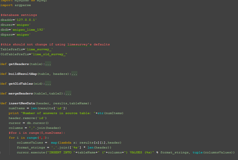
To resolve this problem and enable the importation of old responses tables, I’ve written a quick Python script. It uses MySQLdb, but that library should be installed by default on most Linux boxes. The script also requires a MySQL database backend but it should be easily adaptable to other database engines.
Continue reading “Limesurvey: How to import responses from a modified deactivated table”
Incoming call popup under Ubuntu and Asterisk
When I worked in a survey firm, I was tasked with building a VOIP system to cut costs and to raise productivity. The biggest productivity drain in an outbound call center is the dialing time and getting someone on the line. By implementing an Asterisk server, we could control and expand the server to our needs. Furthermore, this meant we could have remote workers. We saved a bundle of money in long distance and in fixed costs. The hosted server and the bandwidth itself cost about 80$ a month, while the connectivity to the phone network was negligible and, more importantly, flexible. In other words, if it was a slow month, the cost was low, and conversely, if it was a very busy month, the costs were higher but the money was coming in.

Since it was my server and I was billing the company for it, I figured I could use the same server for my personal phones. So I decided to connect my PSTN numbers to this system. I could now use the server as my private VOIP server.
After configuring the VOIP server to my liking, I started to explore the Asterisk API and related Java and Python bindings. My first module was an interactive IVR system to manage callbacks from the survey outbound number. The callers could know who called them and remove their number from our calling lists.
Update (2012): Modified code for asterisk 1.6
Update (2014): Added code (end of page) for KDE
Continue reading “Incoming call popup under Ubuntu and Asterisk”
Using Crystal Reports with Limesurvey
While Limesurvey is a very nice tool to create and manage web surveys, it’s a bit lacking in the reporting area. The functions are a limited and even if you want a quick and dirty, but presentable report, you must export the data and use other tools to format and present the answers to the survey.
While Limesurvey is a very nice tool to create and manage web surveys, it’s a bit lacking in the reporting area. The functions are a limited and even if you want a quick and dirty, but presentable report, you must export the data and use other tools to format and present the answers to the survey.

The problem is the way how Limesurvey stores its data, more specifically the recorded answers. Every column in the table contains theanswer for the question identified by the column and each line (or record) contains a respondent. It seems like a very sensible way to store the respondent’s answers, but the trouble is that it’s very difficult to construct a generic report template in reporting tools with this kind of table schema. To be of any use, the table data have to be converted in a usable form. Furthermore, the schema used by Limesurvey is less than optimal and doesn’t use foreign keys to link tables. This complicates everything.
To convert the answer table data, I’ve written a little python script. It should be pretty plug-and-play. To use it, you have to change the database access variables. The script only takes one argument, the survey id. You can get the survey id in Limesurvey’s administration panel. It should follow the survey title when you select a survey in the administration panel. Continue reading “Using Crystal Reports with Limesurvey”