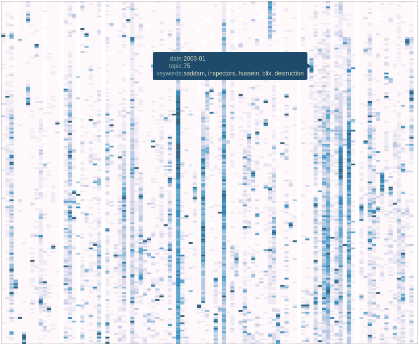
By extracting several topics from our news corpus, we gained a 10,000 feet view of corpus. We were able to outline many trends and events, but it took a bit of digging. This article will illustrate how the topics relate each to one another. We’ll even throw a bit of animation to take a look back the last 15 years.
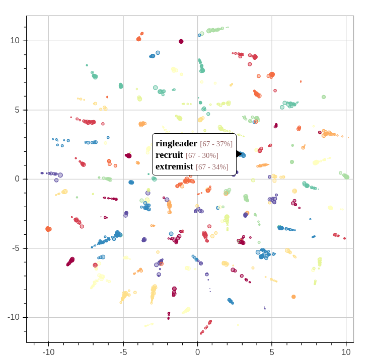
When we extracted the topics from the corpus, we also found another way to describe all the news snippets and words. Instead of seeing a document as a collection of words, we could see it as a mixture of topics. We could also do the same thing with topics: every topics is a mixture of words used in its associated fragments.
Continue reading “15 Years of News – Analyzing CNN Transcripts: Visualizing Topics”
Category: World
15 Years of News – Analyzing CNN Transcripts: Topics
As we saw in the previous article, temporal analysis of individual keywords can be very interesting and uncover interesting trends, but it can be difficult to get an overview of a whole corpus. There’s just too much data.
One solution would be to group similar subjects together. This way, we could scale down a corpus of 500,000 keywords to a handful of topics. Of course, we’ll be losing some definition, but we’ll be gaining a 10,000 feet view of the corpus. In all cases, we can always refer to the individual keywords if we want to take a closer look. Continue reading “15 Years of News – Analyzing CNN Transcripts: Topics”
15 Years of News – Analyzing CNN Transcripts: Timelines
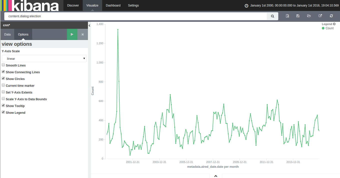
With 15 years of CNN transcripts loaded a database, I could now run queries to visualize the occurrences of words – like names – across time. Since I used a textual database name ElasticSearch, I could use Kibana to chart the keywords. Kibana is a good tool to build dashboards, but it’s not really suited to analyze extensively time series because it lacks an easy way to add several search terms on the same chart. Also, it doesn’t easily show percentages of occurrences in a corpus for a giving time period instead of absolute occurrences. This makes Kibana a good tool for a quick look at the data or to debug an issue with our transcript scrapper.
With this in mind, I used Amazon’s DynamoDB database, the HighChart Javascript library and a bit of glue logic to build my own tool to visualize the last 15 years of News!
Continue reading “15 Years of News – Analyzing CNN Transcripts: Timelines”
15 Years of News – Analyzing CNN Transcripts: Retrieving & Parsing
A while back, I saw that the Internet Archive hosted an archive of CNN transcripts from 2000 to 2012. The first thing that came to my mind was that this was an amazing corpus to study. It contained the last 12 years of news in textual form at the same place. I felt that it would be an amazing project to retrieve all the transcript from 2000 to today and someone went already to the trouble of downloading this corpus.
Unfortunately, the data was basically a dump of the transcripts pages from CNN. This isn’t a problem for archival purposes, but for analysis, it would make things a bit difficult. For my new project, it meant that I would need to find a way to download all the transcripts from CNN, parse them and dump them to a database. To make things even more difficult, the HTML from the early 2000s was more about form that function. In other words, the CNN webmasters (in the 2000, web designers or developers didn’t exist, they were webmasters!) would throw something that would render in Internet Explorer or Netscape Navigator and call it a day. There was no effort in making the layout and content organized.
Continue reading “15 Years of News – Analyzing CNN Transcripts: Retrieving & Parsing”