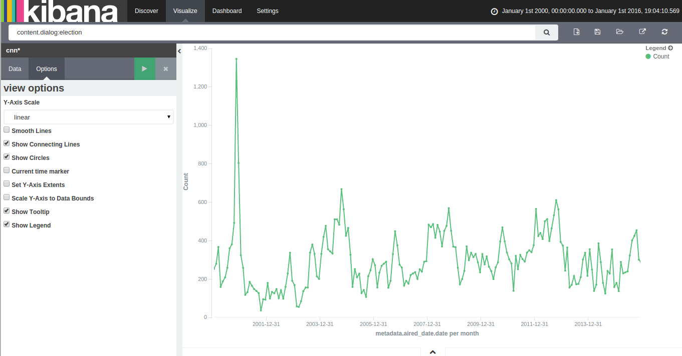
With 15 years of CNN transcripts loaded a database, I could now run queries to visualize the occurrences of words – like names – across time. Since I used a textual database name ElasticSearch, I could use Kibana to chart the keywords. Kibana is a good tool to build dashboards, but it’s not really suited to analyze extensively time series because it lacks an easy way to add several search terms on the same chart. Also, it doesn’t easily show percentages of occurrences in a corpus for a giving time period instead of absolute occurrences. This makes Kibana a good tool for a quick look at the data or to debug an issue with our transcript scrapper.
With this in mind, I used Amazon’s DynamoDB database, the HighChart Javascript library and a bit of glue logic to build my own tool to visualize the last 15 years of News!
Continue reading “15 Years of News – Analyzing CNN Transcripts: Timelines”
Tag: politics
15 Years of News – Analyzing CNN Transcripts: Retrieving & Parsing
A while back, I saw that the Internet Archive hosted an archive of CNN transcripts from 2000 to 2012. The first thing that came to my mind was that this was an amazing corpus to study. It contained the last 12 years of news in textual form at the same place. I felt that it would be an amazing project to retrieve all the transcript from 2000 to today and someone went already to the trouble of downloading this corpus.
Unfortunately, the data was basically a dump of the transcripts pages from CNN. This isn’t a problem for archival purposes, but for analysis, it would make things a bit difficult. For my new project, it meant that I would need to find a way to download all the transcripts from CNN, parse them and dump them to a database. To make things even more difficult, the HTML from the early 2000s was more about form that function. In other words, the CNN webmasters (in the 2000, web designers or developers didn’t exist, they were webmasters!) would throw something that would render in Internet Explorer or Netscape Navigator and call it a day. There was no effort in making the layout and content organized.
Continue reading “15 Years of News – Analyzing CNN Transcripts: Retrieving & Parsing”
Thèmes abordés sur Twitter durant l’élection provinciale de 2012
 Suite à la visualisation des tweets publiés durant la grève étudiante, le professeur Frédérick Bastien de l’Université de Montréal m’a approché afin de participer à l’ouvrage Les Québécois aux urnes.
J’ai donc rédigé un chapitre traitant des thèmes abordés sur les médias sociaux. L’élément central du chapitre était une visualisation de tous les tweets publiés durant la campagne électorale.
Continue reading “Thèmes abordés sur Twitter durant l’élection provinciale de 2012”
IndiceQuebec: Perception de la campagne par les médias sociaux
 Avec mon collaborateur Eric Nguyen, nous avons créé une petite plateforme d’analyse des tweets politiques Québécois, soit IndiceQuebec.com Cette plateforme intercepte les micromessages contenant certains mots-clés comme #polqc ou #qc2012. Les messages sont ensuite stockés dans une base de données, puis analysés à l’aide de multiples modules. En date d’aujourd’hui, soit presque un mois après les élections, 1,5 millions de tweets sont stockés dans la base de données.
Le module le plus intéressant est celui analysant la teneur du message et détermine si le message est plutôt positif ou négatif. Ce module repose sur un modèle bayésien (même principe qu’un filtre de polluriels) qui détermine à l’aide d’un modèle entraîné au préalable sur un échantillon de tweets. Le modèle est ensuite appliqué sur l’ensemble des tweets au fur à mesure que les micromessages sont emmagasinés dans la base de données.
Continue reading “IndiceQuebec: Perception de la campagne par les médias sociaux”
#debatQC – Analyse
 Le débat des chefs durant la dernière campagne électorale était le premier débat où une quantité significative de personnes ont pu commenter le débat à l’aide des médias sociaux. En utilisant l’engin de récupération des Tweets d’IndiceQuebec, nous avons pu récupérer l’ensemble ou du moins une bonne partie des tweets politiques publiés par les Québécois actifs sur Twitter.
L’image à gauche est une analyse du premier débat à Radio-Canada. La deuxième image (cliquez sur Read more) traite des faces à faces diffusées au réseau TVA.
Continue reading “#debatQC – Analyse”
Mapping Political Financing in Montréal
 Using the data cleaned and released by Cedric Sam and Thomas de Lorimier (available on Cyberpresse), I geocoded the data and applied a density map function. The map shows interesting financial patterns in Montréal for the Bloc Québecois and for the Liberal Party of Canada. I’ve chosen those two parties since they have a strong historical influence in Montréal. As we can see on the map, the western part of Montréal is clearly Liberal while the east is more aligned with the Bloc Québécois.
The most interesting clusters are on both sides of Mount Royal. One side, situated in Westmount, contributes noticeably to the PLC while the other side, in Outremont, donates more to the Bloc Québec. To anybody living in Montréal, it’s hardly a surprising fact, but I think it’s nice to see it on a map.
Legislative Explorer | Multidimensional Vote Explorer
 Less visually striking than my last project, this visualization shows the voting patterns of Canadian Members of Parliament. It uses a Principal Component Analysis (or PCA) transformation to convert the multidimensional voting record of each MP to a 2D (or Cartesian) form.
Each point on the chart represents an MP. The color of every MP follows their party affiliation. They are tightly clustered because of party discipline : in Canada, MPs normally vote in accordance to directions given by the Prime Minister.
Continue reading “Legislative Explorer | Multidimensional Vote Explorer”