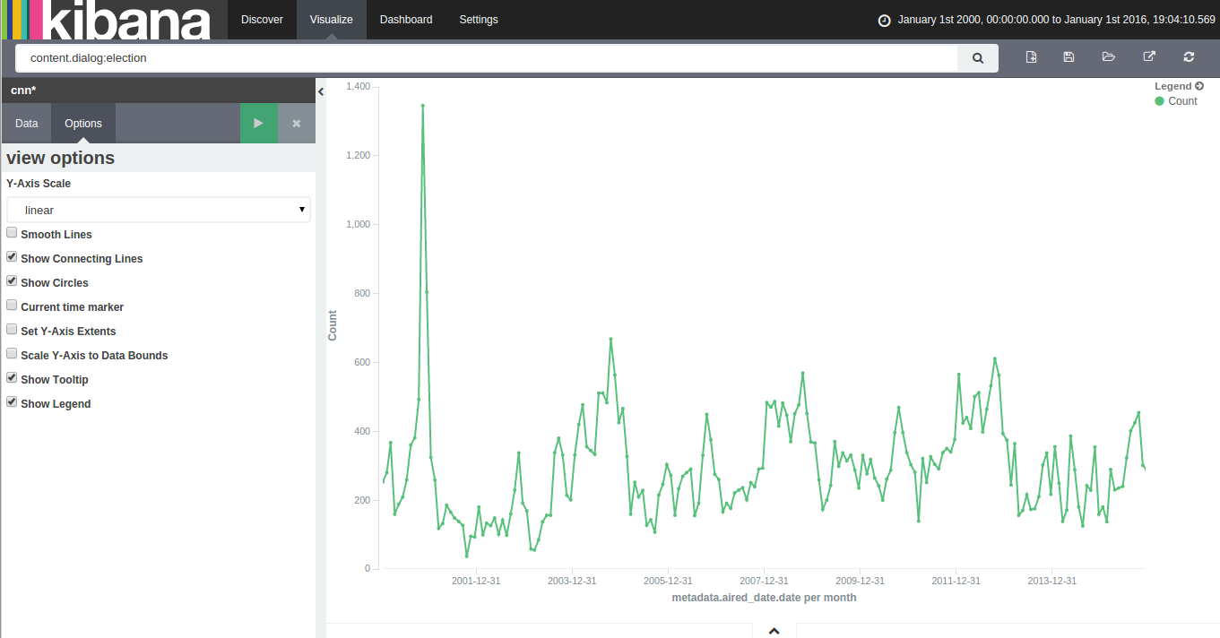
With 15 years of CNN transcripts loaded a database, I could now run queries to visualize the occurrences of words – like names – across time. Since I used a textual database name ElasticSearch, I could use Kibana to chart the keywords. Kibana is a good tool to build dashboards, but it’s not really suited to analyze extensively time series because it lacks an easy way to add several search terms on the same chart. Also, it doesn’t easily show percentages of occurrences in a corpus for a giving time period instead of absolute occurrences. This makes Kibana a good tool for a quick look at the data or to debug an issue with our transcript scrapper.
With this in mind, I used Amazon’s DynamoDB database, the HighChart Javascript library and a bit of glue logic to build my own tool to visualize the last 15 years of News!
Before building the visualization tool, we needed to process our scrapped transcripts. Since these transcripts were from news shows, many subjects/topics were mixed in instead of only having one subject by transcript. While this doesn’t seem like a problem, it makes analysis very difficult since every transcript (or document) would be impossible to classify effectively.
A solution that I found was to split the transcript in many parts and hoping that the law of averages would be in my favor and that every transcript fragment would contain more or less only a subject. So, every transcript were chopped in fragments of ten (10) dialog lines since a quick and unscientific study of the corpus made it look like a little less than the length of a subject which increased the chance of containing a full subject in a fragment. Fortunately, the results of the later stages of the project seemed to agree with my totally baseless assumptions. A later iteration of this project could use topical modeling to classify every dialog line and cluster similar lines to throw away filler and useless dialog lines while grouping similar subjects together.
Using the scripts in the github repository, I retrieved the corpus, split it in ten lines fragments, removed the stopwords, calculated the proportion of keywords contained in the corpus per day for the whole time range. Once this processing stop done, I had a time series of every keywords – around 500,000 – in a file. This file was then uploaded to DynamoDB. This database can be queried directly from the browser which make it very simple to integrate to a charting library. In other words, I could do away with backend code and a server to serve this data. I could send the keyword to DynamoDB and it would give me back a time series to chart.
The time series visualization tool is pretty easy to use. We only need to input a keyword in the field at the top and press enter. If the keyword is valid (I removed those that are too frequent or too rare), the tool will chart the observed proportion of the word across the last 15 years. You can access this tool here, but be aware that it can consume a fair amount of memory if a good amount of keywords are charted since every time series can contain up to 5.5k data points (15 years x 365 days).
The following screenshots are keywords that I found interesting. Hit me up if you find any interesting patterns or keywords!
[huge_it_gallery id=”7″]
In the next article, we’ll see how topic clustering can help us analyze 15 years of news by looking at the whole corpus at once.