By extracting several topics from our news corpus, we gained a 10,000 feet view of corpus. We were able to outline many trends and events, but it took a bit of digging. This article will illustrate how the topics relate each to one another. We’ll even throw a bit of animation to take a look back the last 15 years.
When we extracted the topics from the corpus, we also found another way to describe all the news snippets and words. Instead of seeing a document as a collection of words, we could see it as a mixture of topics. We could also do the same thing with topics: every topics is a mixture of words used in its associated fragments.
Following this line of thought, I built a word by topic matrix. This matrix is enormous since we have 500,000 words and 100 topics which makes a matrix that has 50 millions cells. Of course, we cannot visualize this amount of data, so we need to reduce the amount of data. Since every word is described as a topic vector of 100 values, we could reduce the number of values to two. This would permit us to visualize the words as projected on a two dimension plane. So we need to reduce the number of dimensions.
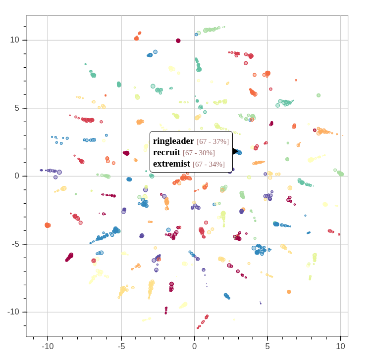
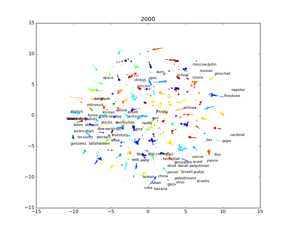
There’s several way to do this, but one of the most popular way is to use T-SNE algorithm. T-SNE gives better results than the other dimensionality reduction methods because of the way it groups similar objects together. Inversely, it sends dissimilar objects (or, in our case, words) apart. This way, if two words projected onto a Cartesian plane do not share the same topics, they should be very far from each other while two words that share the same topics will be closer to each other. The viz.py python script does exactly that.
The results of this transformation is shown in the following interactive chart. It shows words for the past 15 years clustered by similarity. Words that share the same topics are thus clustered together. As explained earlier, every word has an associated topic, identified by a color, which is the most salient topic for a given word. The size of the word is linked to the importance of the word in the corpus and how salient the associated topic is to the word.
This chart illustrate the last 15 years. While it gives a good overview of that time period, it lacks a temporal dimension. The temporal data is available, so it’s possible to generate a chart for every year, month or even day. The problem with this is that there’s too much words and dots to understand what is happening. So even if we show even a small subset of the most salient words, the words will mostly overlap and it will mostly be an ugly jumble of words.
We can use a simple labeling algorithm to solve the label overlapping. The algorithm works like this: we start by ordering the words by salience (or by any other order we would want) and for every word, we get the coordinates of where the word should go on the chart. If the label wouldn’t fit without overlapping other labels, we move the coordinates by following a spiral until we the label fits. We do repeat this operation until we have no more labels to place on the chart.
By varying the size and rotation of the labels, we could even fit more. The python code for this simple placement algorithm is located in the label_placement.py file.
Once we have generated all the maps, we can build an animated gif that shows the last 15 years of news in a couple of seconds.
 The static images for every year are also available in the following slide show.
[huge_it_gallery id=”9″]
A monthly breakdown is available in gif and individual images (in .zip format).
It becomes obvious that the amount of data in this data set is incredible and we’ve just scratched the surface. I have a ton of ideas for the next articles (ex.: lighting up the cities on a world map whenever they were mentioned in the news), so stay tuned!