 I had a lot of positive feedback last year when I designed my map of scientific collaborations. I think that there were two main reasons for this interest. First of all, the map was visually striking; it was abstract but it could still convey useful information about the world. Secondly, I think that the interest that people have in maps is mainly egocentric. In other words, the first thing that we look for when looking at a map, is to see where and how our house, state, country, etc. are represented on that map.
This time I wanted to design a much more detailed map, one that could help to make decisions or help understand scientific collaborations. The USA is a very interesting country because they fund science in such a massive way. Also, the United States is a land of contrasts where no two states are alike and this makes for interesting comparisons.
 While designing the new map, I also wanted to stay away from normal indicators based on ratios and averages. Why? Because most indicators postulate that the system being measured is linear. A linear system is one where the distribution of values follows a normal (or a Gaussian) curve, like the distribution of people’s height in a population. A non-linear system would one where the number of values doesn’t follow a Gaussian curve, like the distribution of letters in the English language or the distribution of wealth (I think that the “1%” referenced by the Wall Street protestors is a good example of a non-linear distribution).
Scientific production and collaboration also tends to behave in this way; the relationship between the number of papers a country produces and the number of scientific collaborations is not the same for each country. It varies a lot.
Using a method developed by Katz (2000) and Archambault et al. (2011) , I calculated a model of scientific collaborations. Using this model, it is possible to compute the number of collaborations that a Metropolitan Statistical Area (or MSA) would be expected to have considering its scientific output. You can read the technical details in this PDF file from a presentation I gave at the 4S conference in Cleveland last November.
 Caveat: In the case of MSAs, the model is almost linear (but not quite), but this is the exception. In the case of states, provinces, countries and even Canadian universities the relationship is non-linear.
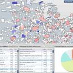
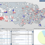
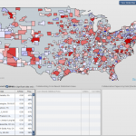
To illustrate this complicated data set, I needed a simple, but intuitive way to present the data. A choropleth map turned out to be the most intuitive way. Granted, it is not as visually striking as my previous map, but it could convey much more information. To implement the viewer, I used a map provided by the US Census and imported it in Flex. I then used the svglib library to dynamically update the map.
 While there is a lot of data available in the tool, it is very simple to use. The global MSA affinity to collaborate is available by clicking on the “View Global Map” button in the right-hand corner. The two radio buttons located next to that button modify how the data is presented on the map: one shows the map with the scale-free collaboration index, and the other one shows the data without a scale-free indicator.
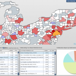
At the bottom of the screen, the collaboration index of every collaborating pair (one MSA with another MSA) is available by clicking a MSA in the first list on the left. A collaboration index higher than one means that the two MSAs are collaborating more than expected considering their scientific output and inversely, a collaboration index lower than one indicates that the two MSAs are collaborating less than expected.
Furthermore, it is possible to characterize the collaborations between two MSAs by selecting a collaborating MSA in the second list. The number of articles (in fractional count – meaning that the number of publications is normalized by the number of authors) is displayed by scientific field (using the Science-Metrix Ontology).
Click here to access the tool.
fantastic tool.