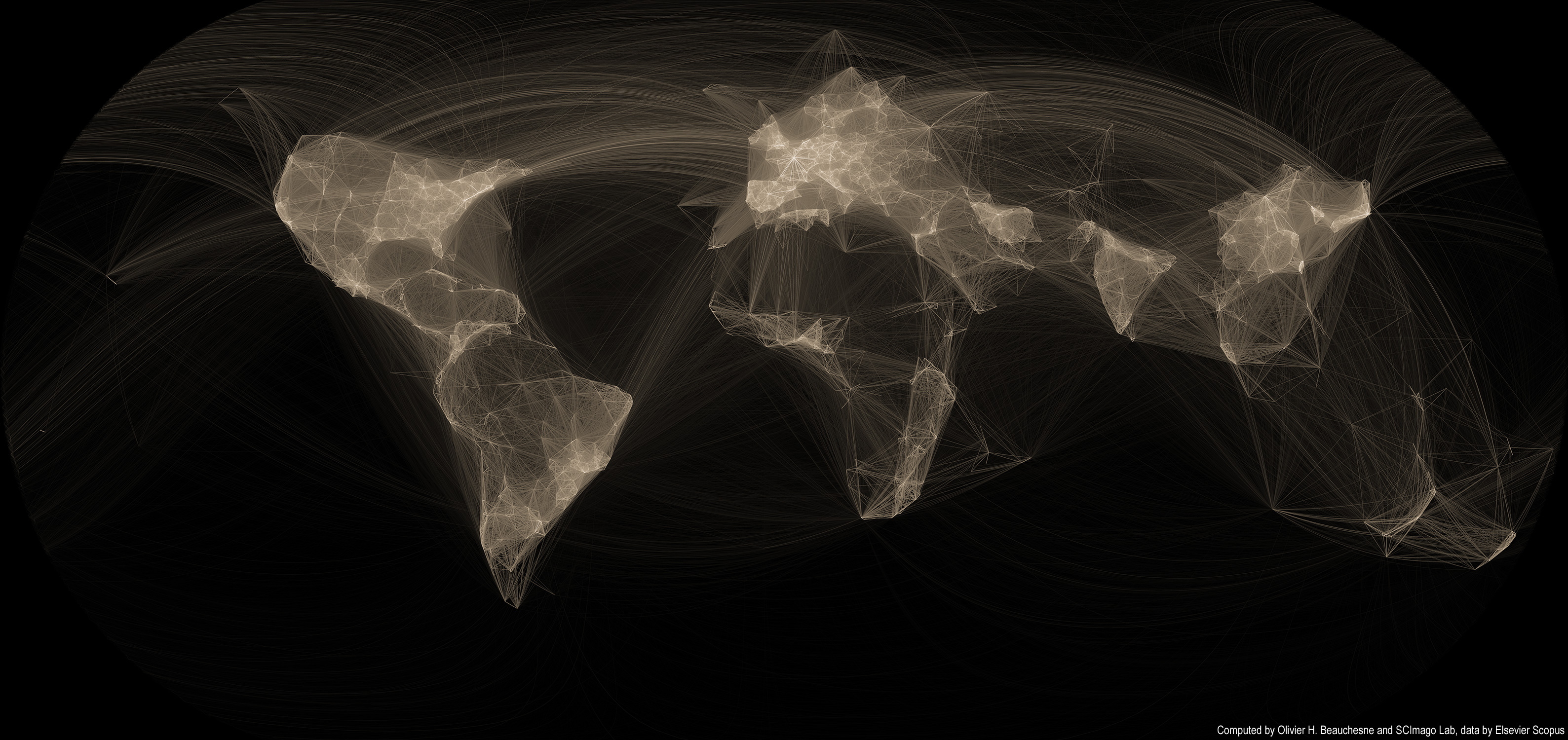
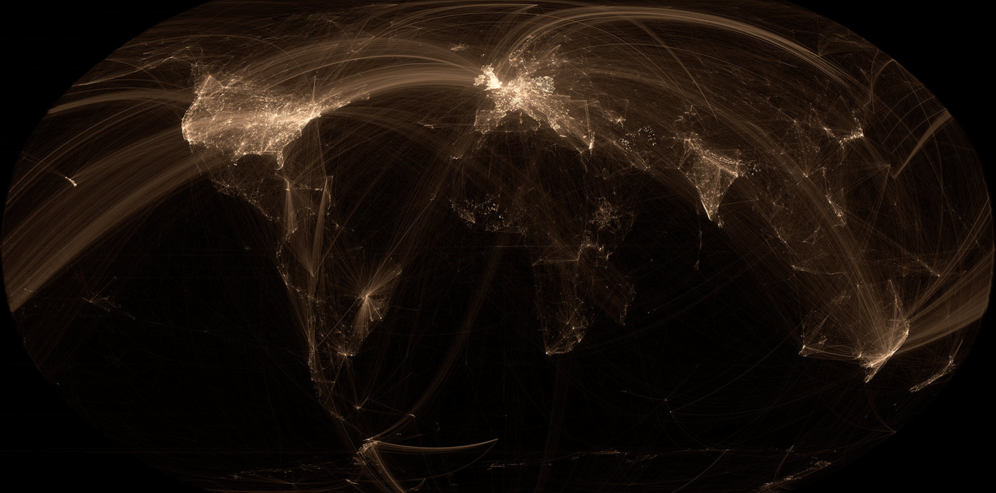
 Several years ago, I created a map of scientific collaborations. The attention this map obtained surpassed my wildest expectations; it got published in the scientific and popular press all around the world! I had mainly forgotten about it until I received an email that rekindled my interest in this visualization and I thought it was high time to revisit this visualization.
Unfortunately, scientific papers (and associated data) are closely guarded and only a handful of firms have full access to them. I now work in a very different field, so I lost access to this dataset. But while perusing my Twitter feed, I came across the very active feed of Scimago Lab. Their social media presence and their incredible interactive visualizations convinced me that they might be interested in collaborating. I sent off an email to their founder, Félix de Moya and, lo and behold, he was interested in collaborating. Cool!
Read on for more maps and an overview of the methodology >>
Continue reading “Map of scientific collaboration (Redux!)”
Tag: network
A Map of the Geographical Structure of Wikipedia Links
There are a lot of Wikipedia visualizations. Some concentrate on article contents, others on the links between articles and some use the geocoded content (like in my previous blog post).
This new visualization is novel because it uses the geographical content of Wikipedia in conjunction with the links between articles. In other words, if a geocoded article (that is, an article associated with a location like a city) links to another geocoded article, a line will be drawn between these two points. The result can be found on the map on the left.
Read on for zoomed views, slideshows, browsable maps, etc.
Continue reading “A Map of the Geographical Structure of Wikipedia Links”
Visualisation – Structure d'influence du conflit étudiant
 Depuis plus de 100 jours, les étudiants et le gouvernement s’affrontent dans les médias traditionnels et les médias sociaux. Les médias sociaux nous offrent la chance d’analyser l’opinion publique sans passer par de coûteux sondages. Évidemment, cette méthode comporte des biais. Par exemple, les individus plus politisés sont bien plus présents sur les médias sociaux. Néanmoins, les médias sociaux demeurent une façon extrêmement intéressante d’analyser les mouvements sociaux à un niveau très désagrégé, soit au niveau des individus.
L’infographie précédente caractérisait le contenu des tweets, celle-ci s’attarde plutôt à la structure des interactions entre les individus. Comme dans l’infographie précédente, un histogramme illustre le nombre de tweets publiés par jour selon différents mots-clics (soit tous les tweets, #manifencours et #casseroles). Il est important de mentionner que les histogrammes sont normalisés, c’est-à-dire que pour chaque histogramme, la valeur maximale est utilisée pour pondérer chaque graphe. Cette méthodologie permet d’illustrer efficacement les variations de chaque série.
Une version haute-résolution en format PDF est disponible ici.
Continue reading “Visualisation – Structure d'influence du conflit étudiant”