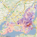
 Using the data cleaned and released by Cedric Sam and Thomas de Lorimier (available on Cyberpresse), I geocoded the data and applied a density map function. The map shows interesting financial patterns in Montréal for the Bloc Québecois and for the Liberal Party of Canada. I’ve chosen those two parties since they have a strong historical influence in Montréal. As we can see on the map, the western part of Montréal is clearly Liberal while the east is more aligned with the Bloc Québécois.
The most interesting clusters are on both sides of Mount Royal. One side, situated in Westmount, contributes noticeably to the PLC while the other side, in Outremont, donates more to the Bloc Québec. To anybody living in Montréal, it’s hardly a surprising fact, but I think it’s nice to see it on a map.
That is an interesting study. I lived in Canada for two years, but it was in the Western part of the country.
Being from America it would be interesting to see this technology applied to our political parties.
Cool stuff! I work in an academic research group at McGill, and one of the projects we are working on relates to determining the sources of funding for political parties in the United States, trying to break it out by job, socioeconomic stratum, geography. I only hope we can make the data look as nice! I will definitely be following your work! Thanks Olivier!