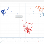
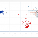
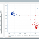
 Less visually striking than my last project, this visualization shows the voting patterns of Canadian Members of Parliament. It uses a Principal Component Analysis (or PCA) transformation to convert the multidimensional voting record of each MP to a 2D (or Cartesian) form.
Each point on the chart represents an MP. The color of every MP follows their party affiliation. They are tightly clustered because of party discipline : in Canada, MPs normally vote in accordance to directions given by the Prime Minister.
 Since in Canada, MPs normally vote in accordance to directions given by the Prime Minister. On rare occasions, MPs can vote as they wish on ethical issues like abortion, the death penalty, etc. or on very regional subjects like gun control, ideally reflecting the opinions of their constituents. Because of that, one could think that an analysis of the voting patterns of Canadian MPs would be of limited value, but the same analysis of the voting record of the American senate (which has no party discipline) is very similar. See here.
 The positions of the clusters don’t follow the usual left-right labelling of political parties. In Canada, the political party that is furthest to the right is the Conservative Party but their MPs are located on the left of the chart. This is because the PCA doesn’t care about our (subjective) labelling of political ideas. Apart from that, the order of the parties mostly reflects reality: the Liberals typically have policies that fall ideologically between the Tories and the NDP (and the Bloc).
I would be really interested in adapting this visualisation to other countries if I can find the raw data.
This visualization can be accessed at http://votum.olihb.com. You’ll need Adobe Flash as it’s a Flex widget. By the way, I know there are a couple of bugs remaining. I’ll look into it when I get the time.