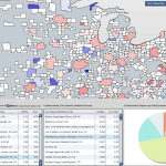
 I had a lot of positive feedback last year when I designed my map of scientific collaborations. I think that there were two main reasons for this interest. First of all, the map was visually striking; it was abstract but it could still convey useful information about the world. Secondly, I think that the interest that people have in maps is mainly egocentric. In other words, the first thing that we look for when looking at a map, is to see where and how our house, state, country, etc. are represented on that map.
This time I wanted to design a much more detailed map, one that could help to make decisions or help understand scientific collaborations. The USA is a very interesting country because they fund science in such a massive way. Also, the United States is a land of contrasts where no two states are alike and this makes for interesting comparisons. Continue reading “Scientific collaborations by Metropolitan Statistical Areas”
